According to Adobe, given 15 minutes to read out the content, two-thirds of the people will prefer to read that is written beautifully rather something that is plain text.
38% of the people will not prefer to engaging with a website if the content or layout is unattractive.
There are many statistics available for websites that show the importance of UX/UI, and it’s not surprising nowadays. Visitors do pay a lot of attention to the design and functionality, and it has become one of the driving forces to rank on search engine, hence getting business.
So, Here we have 11 design tips to make your eCommerce store compelling, and design plays a great role in all these tips:
- Keep Your Design Clean and Organized
- Choose a Responsive eCommerce Theme
- Optimize Your Store for Mobile
- Make your eCommerce Store Easy to Navigate
- Search Bar
- Keep Filtering and Sorting Options
- Add High-Quality Visuals
- Add Product Preview
- Add User Reviews
- Never Miss to Showcase Shipping and Return Policy
- Make Payment Process Extremely Easy
Let’s start.
1. Keep Your Design Clean and Organized
This is one of the most important design tips to look forward to. You probably should have an OCD when it comes to organizing products online. What’s the point if visitors can’t find what they are looking for? Categorize and sub-categorize your products, so the visitors can find any product very easily.
Also, make sure your homepage is clean and sorted. Keep product description, price, and discount percentage labeled on the product. On the other hand, also make sure you have limited products on the homepage. People don’t want to see any mess when it comes to the homepage.
2. Choose a Responsive eCommerce Theme
A very important from the list of design tips for your eCommerce Store. A responsive theme is the one that can satisfy users on every screen resolution i.e. desktop, mobile, and tablet. It is very important for an eCommerce theme to satisfy all kinds of devices, as the users come from a variety of sources. Make a thorough research on eCommerce Themes, and choose the one that fits best with all devices. Here’s a demo of how one theme can be responsive to all the devices.
FYI, Google is suggesting to make websites mobile responsive as 60% of the total Google searches are from mobile.
3. Optimize Your Store for Mobile
As we know, how important mobile has become among all the devices. According to a Search Engine Land article, these are the five important points you should consider when it comes to mobile first optimization:
- Speed
- Don’t block CSS, JavaScript, or images
- Mobile Design
- On-page optimization
- Local Optimization
In terms of user experience, you must make sure that fields on your website are easily accessible. At the time of checkout, users should not struggle with filling up details.
4. Make your eCommerce Store Easy to Navigate
Putting too many menus confuses customers, so it’s better to put submenus under menus. That also allows you to put more links and creates a good-smooth flow. For Example:
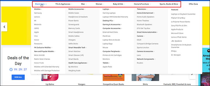 There are plenty of good BigCommerce Themes that come with pre-built menu feature so you can offer a classy user experience.
5. Search Bar
A Search bar is one of the essential parts of any eCommerce website to quickly find whatever you want. According to Nielsen Group, more than 50% of the visitors visiting the start page, directly go to the search bar. That means, a majority of visitors know what they are looking for, so it is utmost important to include a search bar that gives advanced search results.
For example, if someone is looking for “Red Converse Sneakers for Men”, the search results should be sufficient enough to showcase the relevant products.
That brings us to the next tip.
6. Keep Filtering and Sorting Options
As we know, most of the buyers know what they are looking for, there should be tools on your website that can give the right results in fewer efforts. There should be an option to filter and sort product results according to buyers choice. There are many sorting options like:
- Sort by Relevance
- Sort by Popularity
- Sort by Price Low-High
- Sort by Price High-Low
- Sort by Newest First
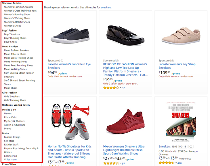
Everytime you search on Amazon, it gives tons of options that include a particular keyword. Here, I tried with the keyword “Sneakers”, and it gave me these results to filter out:
 7. Add High-Quality Visuals
No user will continue with the product that has blurry figures. It is extremely important that you come up with high-quality images in every product description.
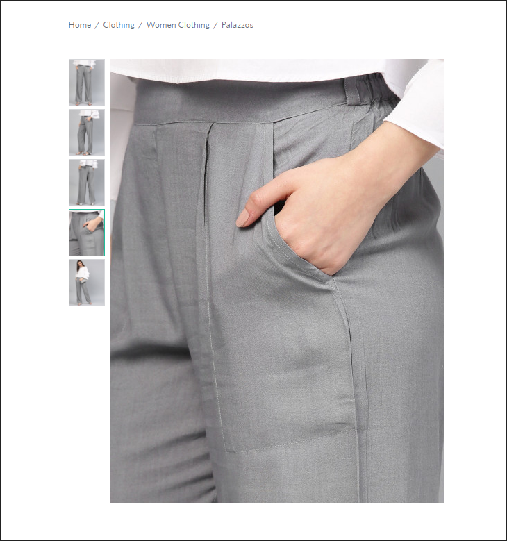 According to justuno, 93% of the customers consider visual appearance to be the key deciding factor in a purchase decision. The same survey suggests, 96% of the users find videos as a helpful tool in the purchase decision. So, it is extremely important to add high-quality visual content as it also improves the average customer time on your website.
Not just product images, but great visuals help a lot in brand building. So, even if you’re posting a blog, never compromise on the quality of the visuals. You can use tools like Lucidpress in the process to create outstanding visuals.
This is one of the most important design tips for your online store, and you’ll see its importance in 2019 for sure.
8. Add Product Preview
Adding a product preview will give a quick view to your potential buyers about the information they seek. All the necessary details like product price, size, details, discount rate, etc can be known with a quick view. There are multiple ways of giving product previews. You can provide a small button on the product grid or user can hover over the product and it shows the preview.
It looks something like this:
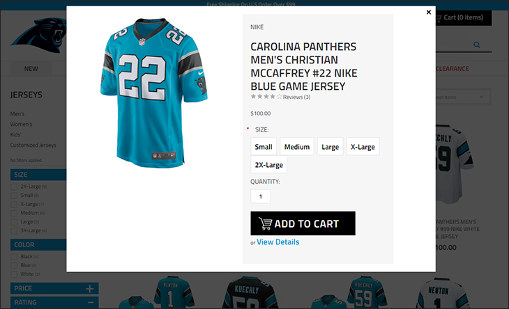 But you also want to make sure that it doesn’t annoy your customers! It should be in control as well as helpful, just in the right amount. Adding a product preview on your online store is a great design tip to follow, and we are sure to see a lot more of it in 2019.
9. Add User Reviews
According to iPerceptions, 63% of the customers are more likely to make a purchase where user reviews are mentioned. Yes, reviews are important, not just in an online purchase, but in a traditional purchase as well. Remember the time when you wanted to buy a refrigerator or a TV, and you took reviews from your friends. Online stores work the same way.
According to Reevoo stats, it increases the conversion rate of the product by 4.6% if there are more than 50 reviews are mentioned. So, the more, the better!
One of the reasons why Amazon is the biggest search engine for products is – Customer Reviews. There are tons of reviews included in every product description, and that drives customers to make an informed purchase.
Good news is, BigCommerce offers user review as one of its built-in features. So you can allow users to post their experiences after the purchase, so they can drive more customers.
10. Never Miss to Showcase Shipping and Return Policy
72% of the shoppers return more than 10% of their purchases. Sure, returning rate shows a lot about your products, but this has been a reason for the loss in initial stages for a lot of eCommerce websites.
Also, when it comes to standout eCommerce websites, design plays an important role, making it important to hire UI UX designers.
Whatever you decide on the shipping charges and return policy, never forget to mention it on the website. Be extremely thorough with the policies you build, mention every possible case and rule when it comes to returning products. The customers want to be clear when they make a purchase. Don’t give them a reason not to trust your brand!
11. Make Payment Process Extremely Easy
28% of the customers abandon the cart because they find checkout process very difficult or too complicated. The checkout process should be easy and filled with multiple options. Almost all eCommerce platforms have started giving various methods of payments like Credit Cards, Debit Cards, Net Banking, Online Wallets, Payment Gateways, etc.
This is one of the most important design tips for your online store that you can’t ignore. Luckily with BigCommerce, you can integrate PayPal One Touch with your platform that makes the checkout process a lot easier. PayPal One Touch is secure, faster, and save a lot of hustle.
Bottomline
So, these were the most important design tips you should keep in mind when it comes to designing your online store. Make sure you choose the right eCommerce Theme to start with because that is the base.
Cheers!

Leave a Reply
You must be logged in to post a comment.