The new year is a time when people make New Year’s resolutions and business owners like yourself set fresh goals for their business. If you’re thinking about revamping your tech website this year, you’ll want to start by finding inspiration to guide you. Here are 10 technology website designs that will jumpstart your inspiration process in 2016.
Rapidops.com
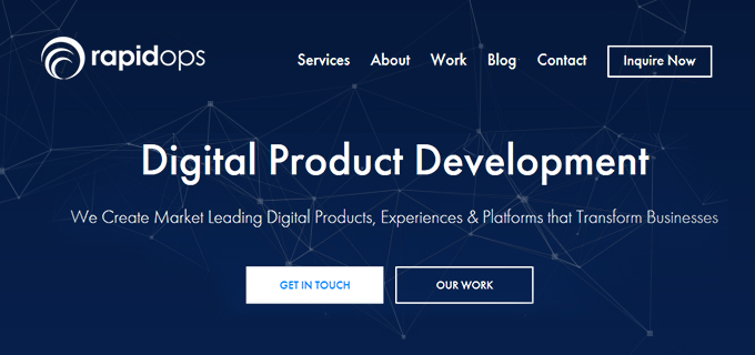
RapidOps Solutions Pvt. Ltd. is a software development company. It develops Digital Products, Experiences, and Platforms that provide real-world solutions, engage users and scale on-demand. They deploy small cross-functional teams that iteratively create product success through constant evaluation and organized learning over time. Building quickly and measuring user and market feedback keeps us in tune with business goals.
Mere from the first sight at RapidOps’ homepage, you’ll get the affirmation that it’s a technology-based company involved actively and dedicatedly in the development of the same. An interactive and attention-grabbing banner with intelligently color coded call-to-action buttons shows us their seriousness to the business they take care of. Website designers can learn a lot from such designs and websites.
Salesmate.io

Salesmate is an all in one cloud-based CRM that enriches customer interactions, boosts sales productivity and helps in winning more deals. Salesmate CRM provides the solution to simplify complex sales processes of small and medium enterprises. With Salesmate, it got a lot easier for businesses to manage their pipeline, save time at all stages of the sales cycle and win new customers without breaking their back.
With the first glance of the CRM website, you can get the idea that it’s a website for a digital product, in this case, it’s about Salesmate. Perfectly placed call-to-action (CTA) buttons, full-screen banner image demonstrating the product application and various other crucial message conveying components that let the visitors know the business sense of the company.

Bridgeline Digital
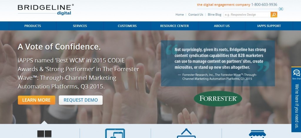
Bridgeline is a digital engagement company that won the 2015 web awards for best technology website. When you land on the site, you’ll see exactly why. Notice that the color scheme is inviting and anything but overwhelming. An orange call-to-action (CTA) button complements the blue color scheme while drawing the eyes to what Bridgeline wants visitors to care about most: their CTA. Plus, testimonials and client logos instill trust in the brand.
Mobile-friendliness also makes this site one of the best for inspiration this year. Take a look at the site on your phone or tablet, and you’ll see that it’s user-friendly across all devices. Since more people are on mobile than ever before, you’ll want to make sure your own design is optimized for mobile in 2016. Use Google’s Mobile-Friendly Test Tool if you’re not sure whether your site is optimized for mobile or not.
Mint
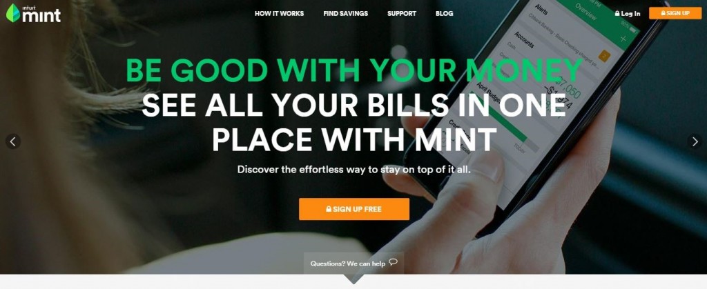
Mint is an excellent site to use for inspiration if you’re building a site for your mobile app. Their site is a perfect example of how to say a lot in few words and how visuals can strengthen your design.
Another aspect that makes this site shine is its site speed. According to Pingdom, the site loads in under three seconds. Faster speeds can mean more business—since fewer people will abandon the site—and better search engine rankings—since page speed is factored into the algorithm. Keep page speed in mind as you move forward with your site revamp this year, which can all start with finding a quality web host.
Evernote
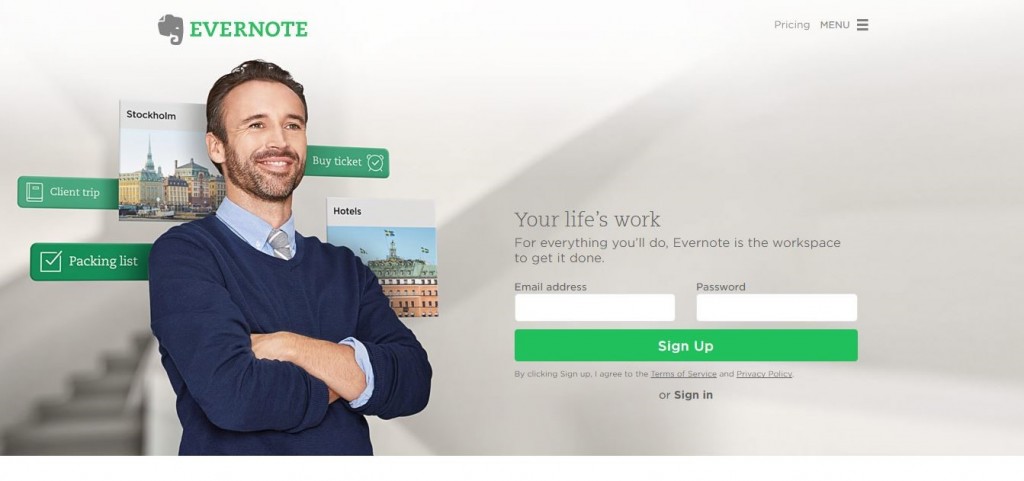
Evernote is another mobile app website to keep your eyes on. A smiling face on the home page helps viewers instantly connect with the site emotionally, and as you scroll down, you’ll notice that everything a new user needs to know is right on the home page in an easy-to-digest manner. Evernote also incorporates a hidden menu bar that’s becoming more popular as more people go mobile, so that’s something you might consider using in your design in 2016.
Logitech
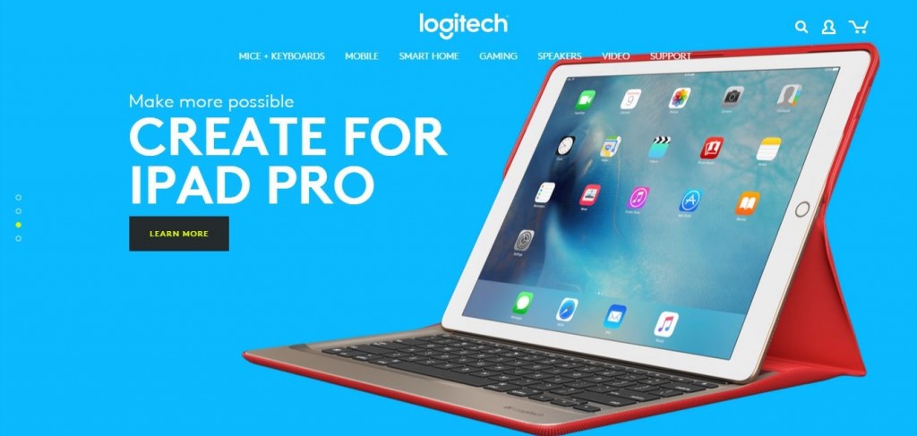
Logitech looks a bit different than these other sites, so it’s a good one to pull inspiration from if you’re not feeling the designs above. Bold colors help the site stick out, and simple navigation helps visitors find exactly what they’re looking for quickly. Logitech also uses a “card” design for their products. This trend is likely to continue, especially because it looks great on mobile!
Apple
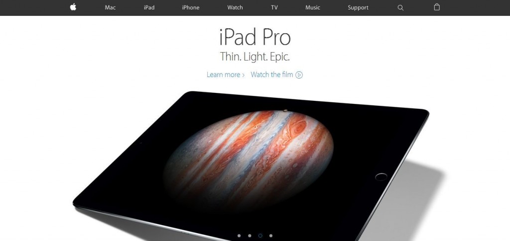
Given Apple’s stock prices, you’d expect them to have a lot of money to put into their website, and it doesn’t disappoint. Apple’s home page highlights their best offers without trying to send you in too many directions. Plus, their product pages are eye-catching, featuring animations as you scroll, which helps set Apple’s site apart from the rest.
Samsung
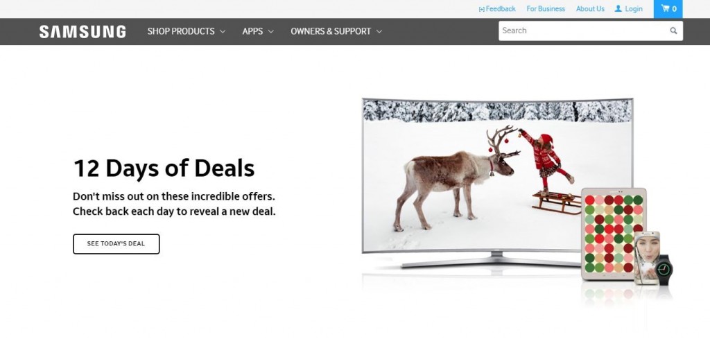
Apple’s competitor Samsung is another site worth checking out for inspiration. Notice first how their color scheme isn’t overwhelming and the boldest colors come into play where they want to draw the eyes most—to account details and feedback survey. With drop-down menus containing a second layer of sub-menus in the navigation, it’s easy to find exactly what you need without clicking through tons of pages.
Envato
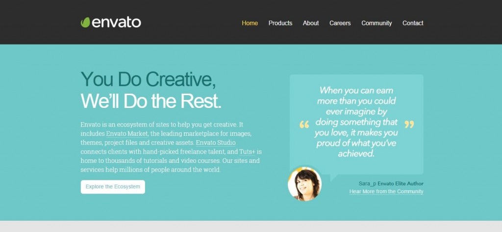
Since Envato is a lesser-known company than some of those mentioned above like Samsung and Apple, they have to do more work to show who they are and what they do. They accomplish this with great copywriting on the home page, and the complementary testimonial helps put trust in their brand. Different color schemes on each page makes navigating interesting while giving each section its own flair.
PayPal
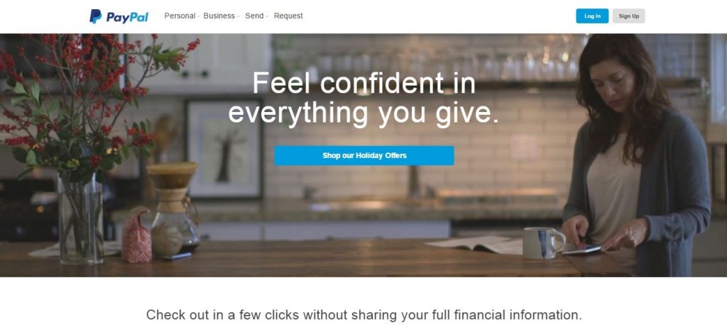
PayPal does things a bit differently on their home page with an animated image. You’ll also notice that with minimal words, they can draw attention to their calls-to-action without demanding too much of their visitors’ time.

Wonderful, what a blog it is! This blog gives valuable facts to us, keep it up.